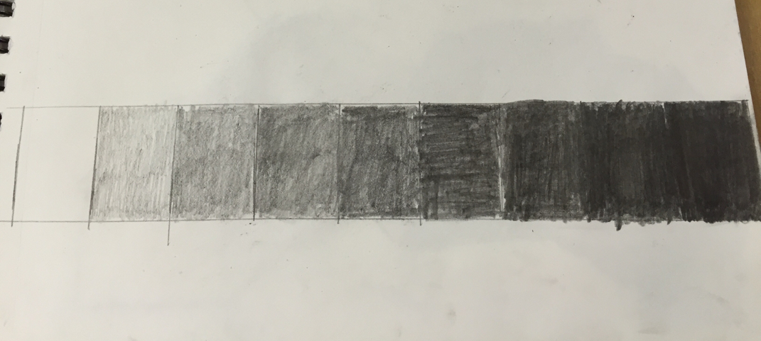
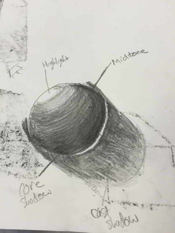
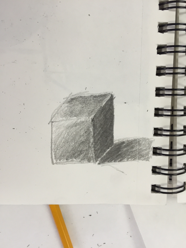
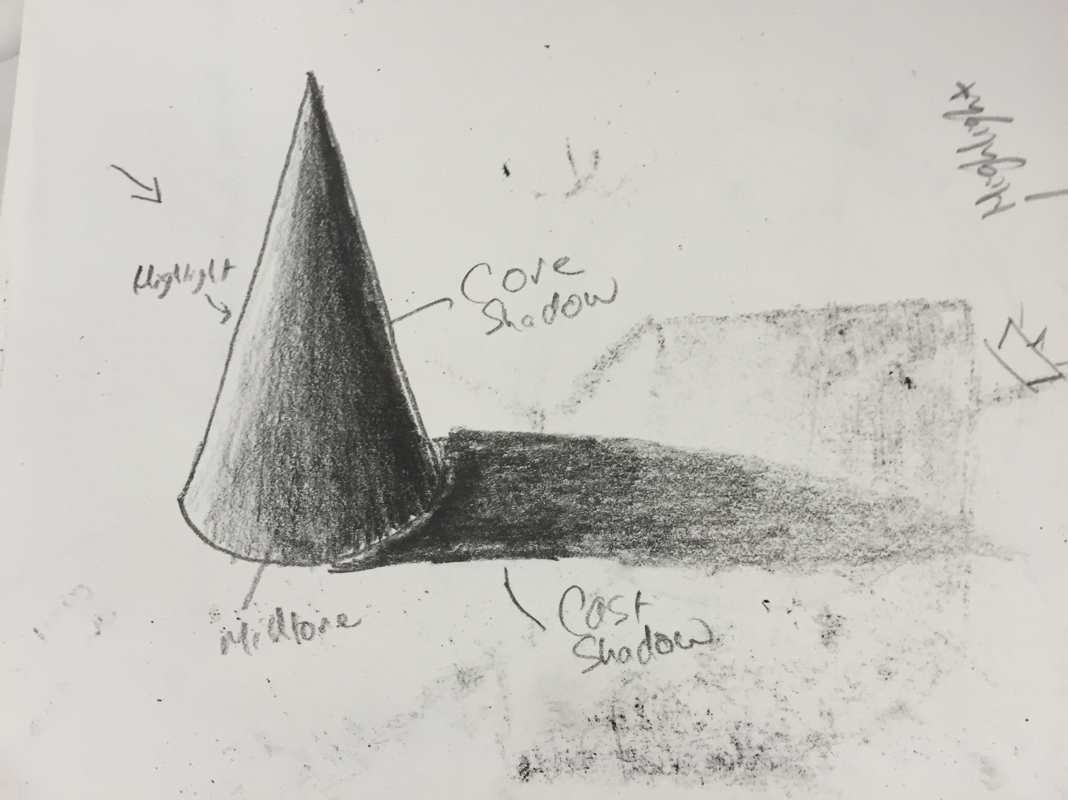
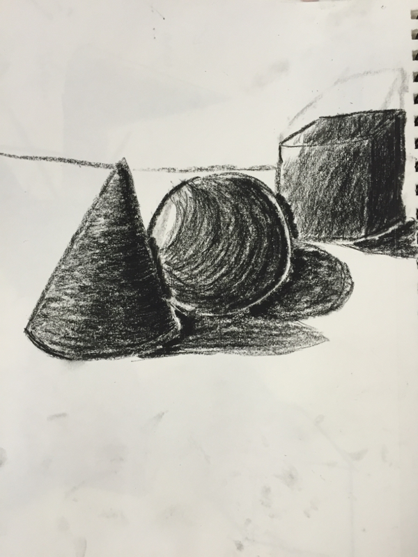
The value chart is a chart that shows from white to black, and all shades of gray in between. You have to share with less pressure the lighter the gray and white, and with more pressure for darker shades of gray and black. You use this to shade drawings. Shading with all the values in the chart adds depth to your drawing, making it look 3 dimensional. Shading the shapes was difficult to do. It was hard to add the correct amount of pressure. Also, shading with the shape to make it look 3 dimensional was hard to do. I think my cones were the best shapes that I drew, and the spheres were my worst. I didn't shade in the shape of the sphere well, so it ended up looking flat.
 RSS Feed
