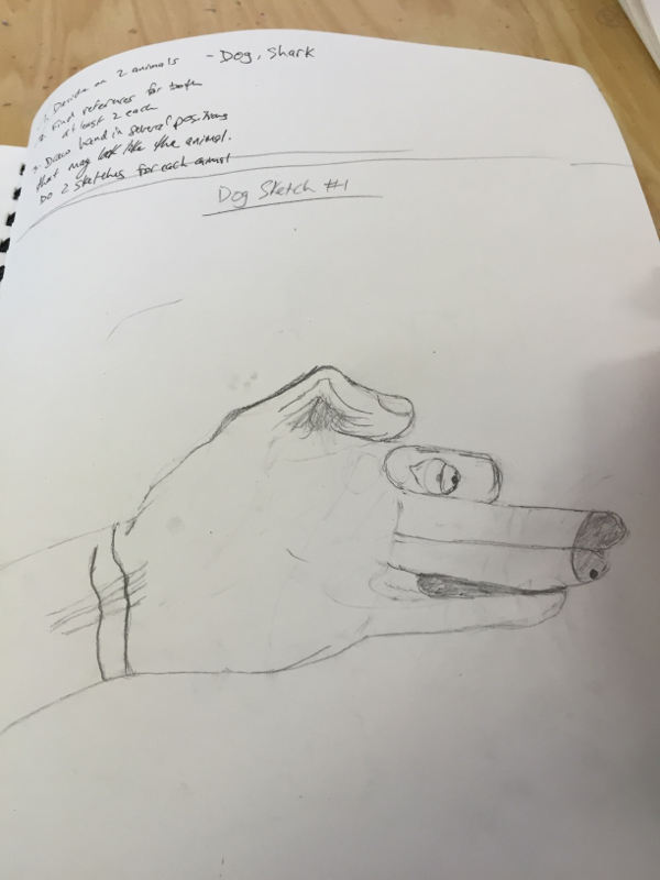
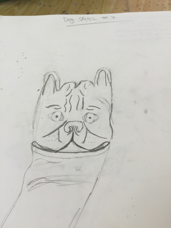
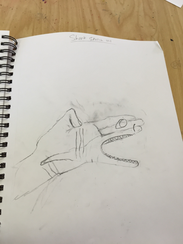
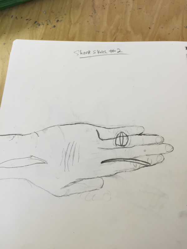
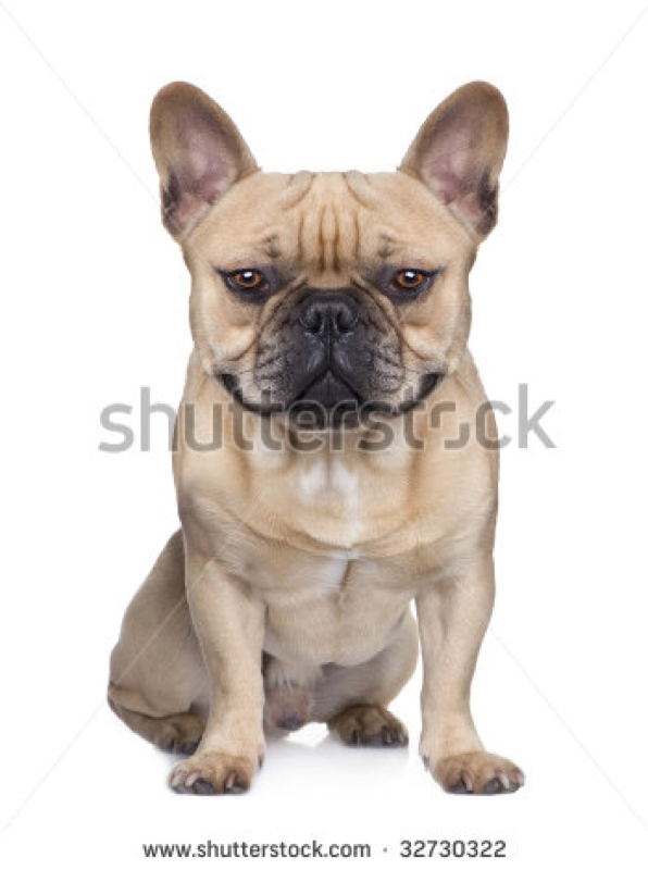
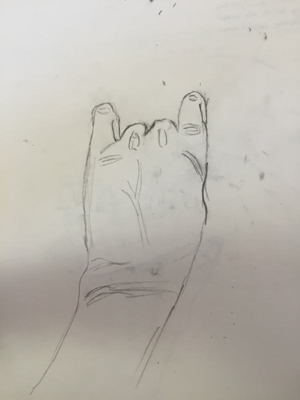
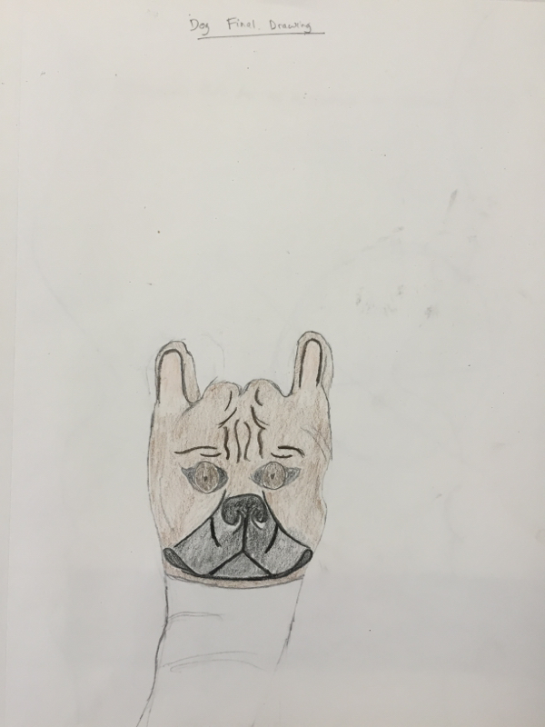
The hand animal was where I drew my hand in a position then drew an animal on top of that. I drew my hand in kind of a fist with my pinky and pointer finger sticking up and drew a dog over it. I tried to draw the dog like a picture from the Internet. The hardest part was making it look like a hand but also look like a dog. Also getting the right color of each part of the dog was difficult. I sketched 2 sharks and 2 dogs. I thought my best was the second dog, so I redrew it for my final. I think I did well drawing most of the lines that I saw in the reference picture on my drawing.
The cartoon skeleton drawing was drawing what we thought a cartoon character's skeleton looked like. The hardest part was drawing the small, detailed bones like the fingers and ribs. It was hard to make the ribs look realistic on suh a small scale. I think my Donald Duck drawing was better than my Tigger one, so I chose it for my final drawing. Once I practiced, I was able to draw better ribs and more detailed bones like the fingers. It was easier to draw the general shape of the character if I traced it first with tracing paper then drew the skeleton inside that. It made it easier for me to draw the bones in the right place. The modified contour drawings were where we could look at the drawing, but still had to keep the pen on the paper and draw every line we see. These were much easier than the blind contour drawings. Being able to look at the drawing made it easier to draw the actual shape of the hand. Drawing the correct size of the hand and correct proportions of the fingers was still a challenge for me. It was much easier to make the hand look realistic though after learning how to draw contour lines and being told to draw every line that you see. The value chart is a chart that shows from white to black, and all shades of gray in between. You have to share with less pressure the lighter the gray and white, and with more pressure for darker shades of gray and black. You use this to shade drawings. Shading with all the values in the chart adds depth to your drawing, making it look 3 dimensional. Shading the shapes was difficult to do. It was hard to add the correct amount of pressure. Also, shading with the shape to make it look 3 dimensional was hard to do. I think my cones were the best shapes that I drew, and the spheres were my worst. I didn't shade in the shape of the sphere well, so it ended up looking flat. The modified shoe drawing was similar to the modified hand drawings, but drawing a shoe instead. We were supposed to draw every line on the shoe that we saw. The hardest part for me was the laces. It was difficult because so many lines were crossing over each other, so it looked very messy in the drawing. I think I did well with the size of the shoe and drawing all of the lines that I could see in the shoe. The blind contour drawings were difficult at first. The hardest part was keeping the pencil on the paper the whole time and moving the pencil at the same time with your eye. Once I got the concept, it was easier to do. I think my first or second drawings were the best. My last one was not good because I accidentally lifted the pencil off the paper and started drawing in the wrong place again. I think the first one has the most lines, but a lot of them are not that close to where they really are on my hand. 1. My experience with oil pastels was good. It was difficult to shade correctly at first, but it got easier quickly. 2. You create value using oil pastels by shading the with light colors close to the light source and with dark colors on the parts further away from the light source. You always shade with the shape in order to make it look 3 dimensional. 3. Overlapping is important because makes a smooth transition between colors. It prevents lines dividing the colors, creating more value and making it look more realistic. 4. Yes I showed a clear light source. The highlights on the left side of the shapes and the shadows going to the right show that the light source is to the left of the shapes. 5. Value is important because it adds depth to the drawing. It makes the shapes look 3 dimensional even though they are on a flat surface. Value makes the shapes more realistic. |
AuthorBen Savino Archives
April 2015
Categories |